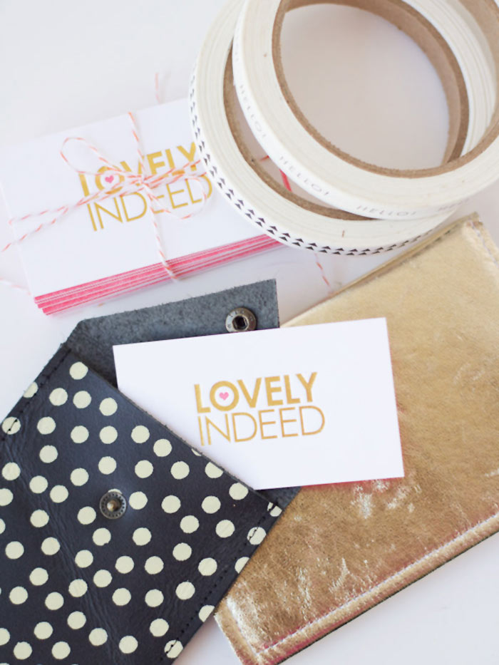
When Chelsea from Lovely Indeed told me that she wanted us to design her business cards again this year, I was thrilled! Then… she said two magic words that made me jump for joy: “gold foil”! (Music to this graphic designer’s ears!!) The resulting business cards feature her logo in gold foil with a letterpressed pink heart on one side and full bleed pink with her name and info reversed out on the other side. Check out Chelsea’s blog post where she talks a little bit about our process and a wacky idea that I had for the back of her biz cards! There’s also details on a special discount that I’m offering on custom designed business cards too!!
photos assoiciated with this post by Chelsea Foy from Lovely Indeed
Comments (0)

As we unpack from our trips and settle back into our day-to-day life as a married (!!) couple, we have one last wedding-related item on our “to do” list — writing thank you notes. It can feel a little overwhelming when you have many to write at once but the Mr. and I have developed a bit of a strategy. So when Amanda of Love Creative asked me to write a guest post for her while she’s off getting hitched, I knew exactly what to write about! Check out my “thank you note” guest post to find out the particulars. (photo by Lupa & Pepi, left to right: custom notecard, Vintage Seed Packet forever stamps via USPS, Sensa pen)
Molte grazie, Amanda, for the opportunity to guest post! Felicitazioni!
Comments (0)

I’m one lucky gal! Not only one but TWO bridal showers are being thrown for me in celebration of our upcoming June nuptials! I’m headed back east this weekend because two of my sister-in-laws are hosting the second bridal shower near where I grew up in Pennsylvania. In contrast to our Jack & Jill shower back in February, this shower is going to be just us gals! How does that translate to the invitation design? A pastel color palette with a pop of metallic gold and a font with lots of swoops and swirls!
This invitation design started with the ombré background (hand drawn by yours truly!). It provided some color and texture upon which the slate grey typography was set. The swirly, curly and very girly Carolyna font is balanced by the clean lines of two sans serif fonts: Bebas Neue (outlined) and Nobel. (Psst, Bebas Neue is a free font download!) The modernity of the sans serif font is carried over to the color of the envelope and the clean lines of the gold herringbone paper used for the envelope liner. The liners were hand cut using Paper Source’s envelope liner template. For a quick refresher on how to line envelopes, check out my DIY video!
Looking forward to sipping some bubbly, noshing cupcakes and catching up with all the gals!
Comments (0)
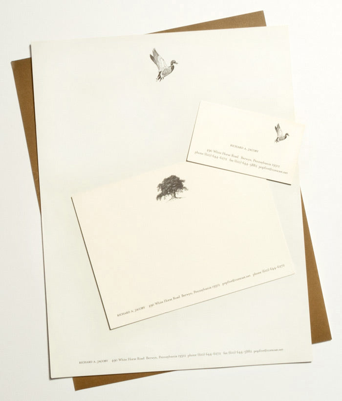 My trip home this past weekend reminds me of one of the first personal stationery sets that I designed. It was a retirement gift for my step-father. While he was no longer going into the office every day, he planned to continue to conduct business and I wanted to make sure that he had handsome papergoods to do so!
This stationery set was very much inspired by the rustic countryside in which I grew up and were my step-father still lives — a place where mallard ducks, gorgeous old trees, horses and rolling hills abound! An etched illustration style immediately came to mind as the perfect way to portray these elements of the countryside. Classic cream paper paired with graphite ink began a classy and sophisticated palette. The chocolate brown, printed full bleed (that’s a fancy printing term for from one edge to the other) on the back of the letterhead, notecard and business card, lends some weight and masculinity to the set. The back flap of both the #10 envelope and the notecard envelope (not pictured here) are printed with the return address and a complementary etched illustration — mallard duck standing and acorn, respectively. Check out more of Lupa & Pepi’s custom papergoods and let us know your stationery inspiration!
Comments (0)
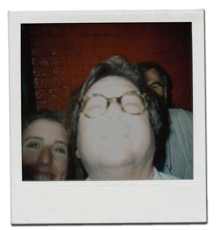 from left to right: me, Wolfgang Weingart, Hans Allemann
It might not look like it but this guy (above) is an incredibly influential graphic designer. The summer before my senior year of college, I was lucky enough to study with him at a typography workshop at Maine College of Art in Portland, Maine. For those of you who don’t know, Wolfgang Weingart is the creator of New Wave aka Swiss Punk typography (trust me, it’s a big deal!).
The last evening of the workshop (as with most of the other evenings!) we all went out for drinks. But this time, Wolfgang joined us! At one point in the evening, Wolfgang was talking to Hans Allemann (another renowned graphic designer). With two of my graphic design idols in one place and with a little liquid courage, I interrupted to ask to have a photo taken with them. Out of nowhere, Wolfgang grabbed my camera and snapped a self portrait. I blurted out “I want to be in it….” and managed to squeeze myself into the frame. This photo (which is way better than any posed shot would have ever been!) is one of my prized possessions and has been in a frame on my desk ever since.
Comments (0)
