
As we unpack from our trips and settle back into our day-to-day life as a married (!!) couple, we have one last wedding-related item on our “to do” list — writing thank you notes. It can feel a little overwhelming when you have many to write at once but the Mr. and I have developed a bit of a strategy. So when Amanda of Love Creative asked me to write a guest post for her while she’s off getting hitched, I knew exactly what to write about! Check out my “thank you note” guest post to find out the particulars. (photo by Lupa & Pepi, left to right: custom notecard, Vintage Seed Packet forever stamps via USPS, Sensa pen)
Molte grazie, Amanda, for the opportunity to guest post! Felicitazioni!
Comments (0)

I’m one lucky gal! Not only one but TWO bridal showers are being thrown for me in celebration of our upcoming June nuptials! I’m headed back east this weekend because two of my sister-in-laws are hosting the second bridal shower near where I grew up in Pennsylvania. In contrast to our Jack & Jill shower back in February, this shower is going to be just us gals! How does that translate to the invitation design? A pastel color palette with a pop of metallic gold and a font with lots of swoops and swirls!
This invitation design started with the ombré background (hand drawn by yours truly!). It provided some color and texture upon which the slate grey typography was set. The swirly, curly and very girly Carolyna font is balanced by the clean lines of two sans serif fonts: Bebas Neue (outlined) and Nobel. (Psst, Bebas Neue is a free font download!) The modernity of the sans serif font is carried over to the color of the envelope and the clean lines of the gold herringbone paper used for the envelope liner. The liners were hand cut using Paper Source’s envelope liner template. For a quick refresher on how to line envelopes, check out my DIY video!
Looking forward to sipping some bubbly, noshing cupcakes and catching up with all the gals!
Comments (0)
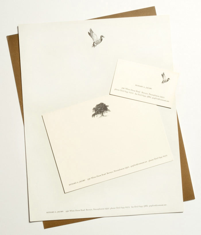 My trip home this past weekend reminds me of one of the first personal stationery sets that I designed. It was a retirement gift for my step-father. While he was no longer going into the office every day, he planned to continue to conduct business and I wanted to make sure that he had handsome papergoods to do so!
This stationery set was very much inspired by the rustic countryside in which I grew up and were my step-father still lives — a place where mallard ducks, gorgeous old trees, horses and rolling hills abound! An etched illustration style immediately came to mind as the perfect way to portray these elements of the countryside. Classic cream paper paired with graphite ink began a classy and sophisticated palette. The chocolate brown, printed full bleed (that’s a fancy printing term for from one edge to the other) on the back of the letterhead, notecard and business card, lends some weight and masculinity to the set. The back flap of both the #10 envelope and the notecard envelope (not pictured here) are printed with the return address and a complementary etched illustration — mallard duck standing and acorn, respectively. Check out more of Lupa & Pepi’s custom papergoods and let us know your stationery inspiration!
Comments (0)
When Robin and Sarah from GATHER Events asked me to be a part of their rehearsal dinner styled photo shoot, I was excited. When they explained their concept to me, I was ecstatic! Basically they handed me this inspiration board:
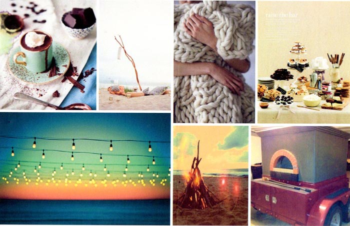
I was immediately in love with the textures — grainy sand, thick cable knit blanket, smooth marshmallow-y desserts. Then I was enraptured by the colors — creamy white, hazy smoke from the fire against the gradient of the sunset. It felt sumptuous yet cozy, casual and inviting. Needless to say, I was incredibly inspired!
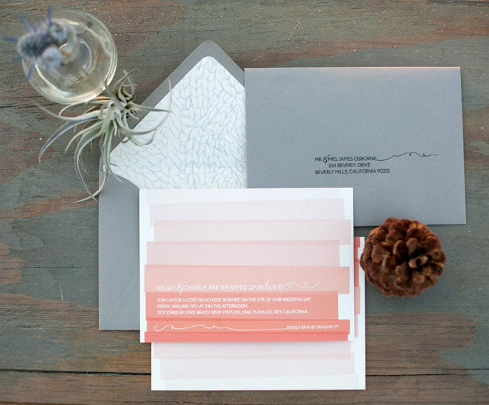 The cable knit from the inspiration board lead to the hand-drawn envelope liner which is contrasted with a graphic interpretation of the sunset gradient on the invitation. Yarn from the cable knit is also referenced with the twirl-y flourishes that accent the text on both the invitation and the mailing address. The color palette includes warm tones on the invitation which is then placed into the smokey grey envelope.

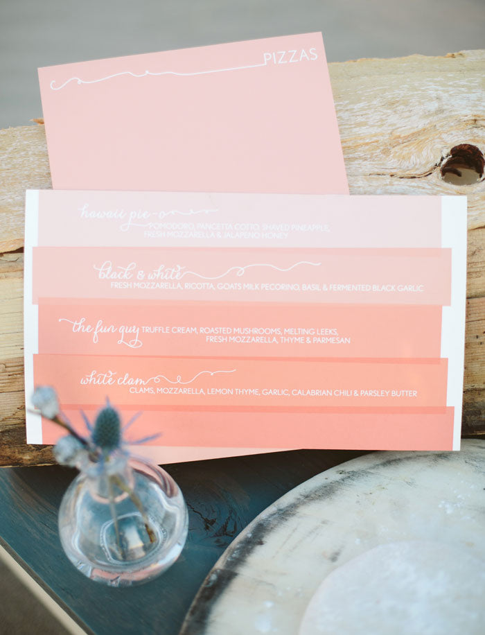
The typographic elements and graphic sunset gradient featured on the invitation were echoed in the menu design. Drinks were skillfully concocted by Pharmacie and pizzas were baked in Urban Pie‘s mobile (yes, mobile!!) wood burning oven.
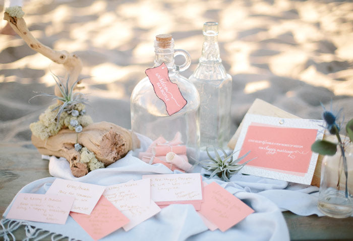 Given that we were on a beach, it only seemed natural for the guest book to take the form of a “message in a bottle”. We tweaked it slightly and called it “wisdom in a bottle” encouraging guests to give some words of advice to the soon-to-be-wed couple. To make it a little more authentic, Robin and Sarah burned the edges of the sign hanging on the glass jug to give it texture and lend a little bit of a smokey quality to it.
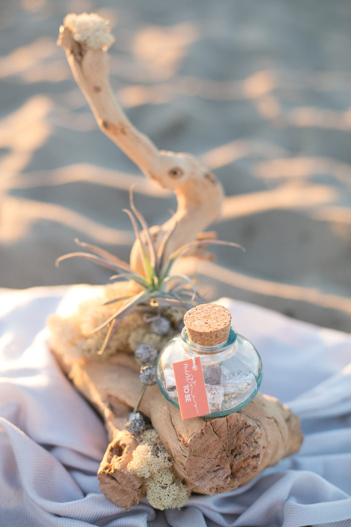 The favors — delicious “Pigments” by Petite Pig — are in a glass jar sealed with a cork and a tag that reads “Mint to be”.
Check out the entire shoot from this talented team assembled by GATHER Events and featured on 100 Layer Cake!
Photography: Heather Kincaid // Concept, Event Design, Florals, Production, Styling: GATHER Events // Furniture, Custom Napkins, Pillows, Styling: Borrowed Blu // Hair & Makeup: Tara Dowburd-Luftman // Pizza: Urban Pie // Favors: Petite Pig // Cocktails: Pharmacie
Comments (0)

Ciao Amici!
It’s a big year! Not only am I starting this blog… I am also getting married in June! (So excited!!) Between all of the gown shopping, venue hunting and cake tastings, I am designing all of the papergoods for the entire affair. And by “all” I mean e-v-e-r-y-t-h-i-n-g! First up? Our Jack & Jill shower invitations. A few weekends ago my fiancé, Jason, and I were lucky enough have a Jack & Jill shower thrown for us at Mozza here in LA. Because the party was scheduled for a Friday evening and both guys and girls were invited, I wanted to design something that would evoke the convivial spirit of the evening while not getting too “girly”.
The first design element that popped into my head was the font Birmingham. I downloaded this font (for free!) months ago and have been eager for the opportunity to design with it. This quirky serif font with extra wide W’s, M’s and A’s embodies a sweet, handwritten quality that fit the vibe of the evening: casual elegance with a bit of personality. Complementary to the font, a hand drawn frame and illustrations of hearts and arrows are integrated with the typography to define the space. Lastly, to make sure everyone knew who the “Mr. & Mrs. to be” was, Jason and I did silhouette drawings that I then scanned and placed into the layout. As for the color palette — a pop of persimmon on an otherwise monochromatic invitation is carried over to the envelope color and punctuated with the heart and arrow strategically placed on the envelope liner.
And so begins the parade of papergoods that I will be creating in the upcoming months for our wedding…
Comments (0)
