Ampersand: Hera Big
I have a confession to make: My name is Rachel and I am addicted to ampersands. I get a rush if I throw one into a sentence in lieu of “and”. It’s not the proper way to write prose, I know that. But it just feels so damn good! So succinct. One character. But email fonts rarely give me the true high that I seek. The ampersand for Helvetica or Times New Roman are good and all, but sometimes I just need that fix. You know… the good stuff.
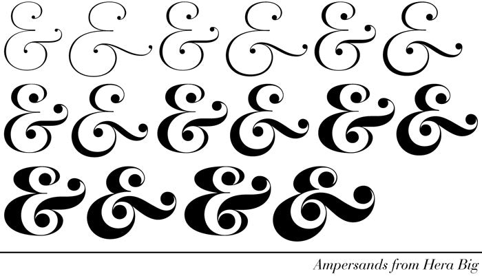
A “good” ampersand may be comprised of any combination of characteristics. Some are very simple with well balanced thick and thin lines while others are quite ornate with big swoops and swirls. I will say this — if I go too long without a good ampersand, I develop a case of the cold sweats. So, the fact that “Lupa & Pepi” has an ampersand in it may or may not be a coincidence. When I sat down to draw logo sketches for Lupa & Pepi I began to sift through my mental card catalog file of ampersands and pick one to design with. I didn’t get too far as once I got to Hera Big, my heart skipped a beat. I knew I had found my fix. The abundance of options (above) in the weight and that fantastic cross-bar swath with big circles on either side feels casual, effortless and approachable yet polished and considered with a hint of style.

With the ampersand font selected, I wanted to incorporate a graphic element to give a subtle sweet touch. I began experimenting with ways in which I could incorporate a heart into the design of the ampersand. The digital sketches (above) illustrate my thought process. The “winning” ampersand (far right) feels well-balanced in that the heart is the same scale as the other circles on the ampersand and the small space between the bottom of the heart and the cross-bar creates an implied connection without literally touching. I won’t get cheesy and bore you with the metaphors that I felt this represented when it comes to my papergood designs rather let’s just skip to the final logo design:
![]()
The words “Lupa” and “Pepi” are typeset in Hera Big Extra Light while the ampersand (a.k.a. the pièce de resistance) is based upon Hera Big Light Italic with the small addition of the heart. And that’s how I got my ampersand fix!
